A practical look at web design trends for 2026 and how small businesses can use them without chasing fads.
Each new year brings plenty of blogs and videos predicting the web design trends for the next twelve months. While they can be interesting, I prefer to avoid short-lived fads and clever wizardry. Many never come to fruition, or they conflict with the basics of clear, high-converting websites.
Here’s my take on what is actually important for your website in 2026.
Minimal user interface design continues to be important, this approach is about giving content space to breathe. Clear layouts, sensible spacing, and simple sans-serif typefaces help visitors understand what a business does without effort.
For small businesses, this matters more than visual flair.
I sometimes worry my designs can feel plain - but I have to remind myself, I'm designing for my clients' clients, not to impress my peers. When someone lands on your site, they need to understand you quickly, with predictable layouts and structure that avoids friction.
This style also supports SEO and accessibility. Clear structure, logical headings, and readable typography make pages easier for search engines and AI tools to understand.
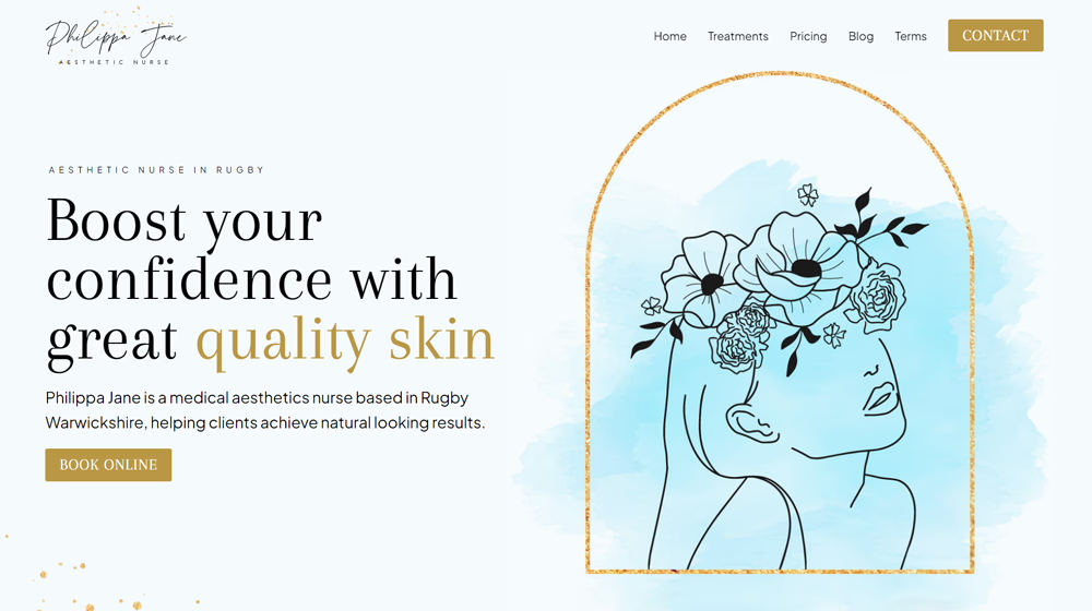
I'm seeing a shift away from stark whites and harsh contrasts. More sites are using warmer, natural colours. Soft browns, clay tones, muted greens and blues create a grounded feel. When paired with subtle textures, like linen or light grain, a website can feel considered rather than manufactured.
These textures should never shout. In most cases, you only notice them if you look closely. Their job is to add warmth and depth, not decoration.
This approach works especially well for service businesses. It builds trust quietly and helps a site feel human and welcoming.
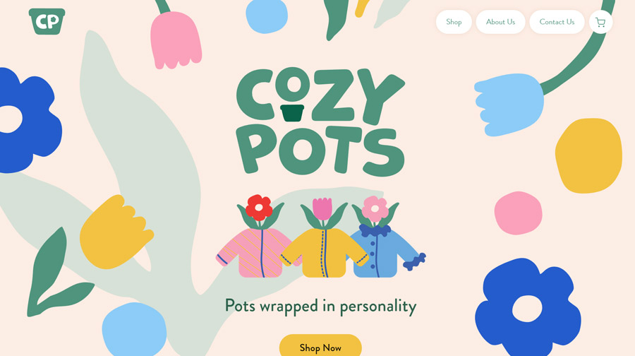
For years, many websites looked identical. Perfect grids. Perfect photography. Perfect alignment.
There is now a gentle pushback against that. Not towards mess or chaos, but towards authenticity. This shows up in hand-drawn elements, imperfect illustrations, real photography, and sometimes even images that are not technically perfect. Slightly wonky visuals can feel more honest than polished stock photography.
Used carefully, these touches make a website feel real. They remind visitors there are people behind the business, not just templates and automation.
It might seem contradictory after exploring softer, earthy palettes, but there is still plenty of room for bold colour in modern web design.
Strong accents like bright pinks, electric blues, (just like this site) are being used to guide attention. The key is restraint. When bold colour is used everywhere, it loses impact. When it is used sparingly, it feels confident and clear.
This approach works well for calls to action, where visitors need a gentle nudge on what to do next.

One of the biggest changes in web design is not visual at all.
Websites now need to be understood by AI-driven search tools as well as traditional search engines. That means clearer explanations, better structure, and content that answers real questions.
I am seeing a strong move towards longer-form content, clear subheadings, and FAQs on key pages. These help AI tools understand context and meaning, while also helping visitors feel informed and reassured.
This is not about stuffing pages with keyword-rich text. It is about explaining things properly, in plain language, and structuring pages so they are easy to scan and summarise.
Good web design is not about following trends for their own sake. The most effective websites take elements from these ideas and use them thoughtfully.
Everything should support understanding and reduce effort for the visitor.
If you are planning a new website or refining an existing one, I always start with clarity first. Trends come second, and only when they genuinely help the message land.
If you would like to talk through how this could apply to your own website, feel free to get in touch. I am always happy to explain what will work best for your business.